
"Zoom in, it keeps people watching" is one of those claims everyone repeats and nobody proves.
So let's prove it — with numbers, not adjectives. There is a real, measurable, physical reason your unzoomed screen recording loses viewers, and once you see the arithmetic you can't unsee it.
The short version: on a phone, the text in your recording lands at roughly 8 arc-minutes of visual angle. The international standard for comfortable reading is 16 to 22. You are asking your audience to read something that is, by measurement, about half the size a human can comfortably read. They don't consciously notice. They just leave.
Here's the full working.
Why "font size" is the wrong unit
Your UI text is 14 pixels. That number is meaningless on its own.
What the human visual system actually cares about is angular size — how much of your field of view a thing occupies. A 14px label is enormous if the screen is pressed to your nose and invisible from across the room. The unit is the arc-minute: one-sixtieth of a degree of your visual field.
This is measurable, and there's a standard for it. ISO 9241-303, the ergonomics standard for electronic visual displays, recommends a character height of 20 to 22 arc-minutes, with 16 arc-minutes as the minimum acceptable for sustained reading. Below roughly 10 arc-minutes, reading speed falls off a cliff. Around 5 arc-minutes you're at the limit of what 20/20 vision can even resolve as a distinct character.
Hold onto those numbers: 16 is the floor. 20-22 is comfortable.
Now measure your own recording
Take a normal setup: you record a 27-inch 1080p display. A typical UI label — a menu item, a form field, a settings row — has a cap height of about 11 pixels in that capture.
What you see while recording. A 27-inch display is about 597mm wide. Spread 1920 pixels across it and one pixel is 0.31mm. So your 11px label is 3.4mm tall. You sit about 600mm away.
3.4mm ÷ 600mm → 19.5 arc-minutes.
That's inside the comfortable band. This is exactly why the recording looks completely fine to you when you review it. You are the one viewer for whom it works.
What a phone viewer sees. Now that same recording plays fullscreen, landscape, on a 6.1-inch phone. The video is about 147mm wide. The 1920px frame now maps onto 147mm, so one pixel is 0.077mm. Your 11px label is now 0.84mm tall. Phones are held at roughly 350mm.
0.84mm ÷ 350mm → 8.2 arc-minutes.
Half the minimum. And that's the generous case — fullscreen landscape. Watching in-feed, portrait, the video is only as wide as the phone, ~71mm, and your label drops to 4.0 arc-minutes — below the threshold at which the eye can reliably resolve a character at all.
| Who's watching | Cap height on the glass | Visual angle | vs. ISO 9241 |
|---|---|---|---|
| You, 27" desktop at 60cm | 3.4mm | 19.5 arc-min | Comfortable |
| Phone, fullscreen landscape, 35cm | 0.84mm | 8.2 arc-min | Half the minimum — sustained strain |
| Phone, portrait in-feed, 35cm | 0.41mm | 4.0 arc-min | At the acuity limit. Effectively unreadable. |
| Phone, landscape, with a 2x zoom | 1.7mm | 16.5 arc-min | Back above the floor |
Read that last row again, because it's the whole point.
Why 2x, specifically
The bottom row isn't a coincidence, and it's the most useful number in this article.
Going from 8.2 to 16.5 arc-minutes takes exactly a 2x magnification. That is precisely the amount required to move a phone viewer from "below the ISO minimum" to "at parity with what the creator sees on their desktop."
This is why well-built auto-zoom tools converge on a default around 1.5x to 2x. It isn't an aesthetic choice. It's the magnification that closes the gap between the screen you recorded on and the screen they're watching on. Less than that and you haven't solved the problem. Much more and you've started cropping away context for no additional legibility gain.
If you take one thing away: a 2x zoom is not a stylistic flourish. It is the correction factor for the difference between a 27-inch monitor and a phone.
What that strain actually does to retention
Falling below the legibility threshold doesn't produce a conscious thought like "this text is too small." It produces three effects the viewer never attributes to your video.
Visual search replaces learning
At 8 arc-minutes your viewer can see that there's text, but not what it says without effort. So they do a visual search: scan the frame, find the cursor, work out which of the forty on-screen elements you're talking about, then decode the label.
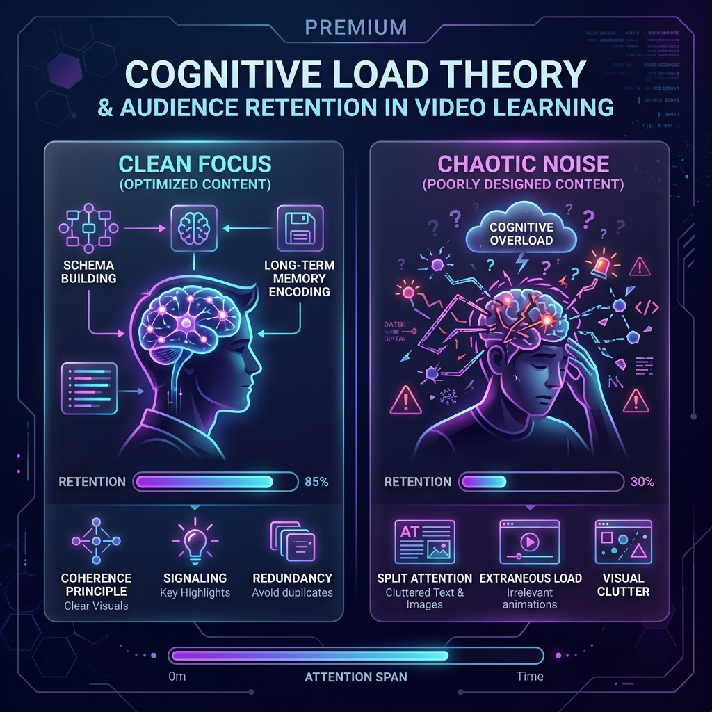
Every second spent on that search is a second not spent understanding your actual lesson. This is the split-attention effect — when the information needed to understand something is scattered, working memory burns capacity on integration instead of comprehension.
Enjoying this read?
Get weekly insights on video editing, AI workflows, and creator growth straight to your inbox.
It's all extraneous load
John Sweller's Cognitive Load Theory splits mental effort into load that's intrinsic to the material, germane load that builds understanding, and extraneous load — effort wasted on how the information was presented rather than what it says.
Squinting at a 1440p dashboard shrunk to 71mm is pure extraneous load. It contributes nothing. And working memory is a fixed budget: every unit spent decoding your interface is a unit unavailable for the concept you're teaching.
You failed to signal
Richard Mayer's signaling principle (also called cueing) in the Cognitive Theory of Multimedia Learning holds that learners perform better when cues direct attention to the essential material. Multiple meta-analyses find small-to-moderate but consistent positive effects on both retention and transfer.
A zoom is the single most powerful cue available in a screen recording. It doesn't just make the target bigger — it removes everything else from the frame. A flat, unmoving full-desktop capture signals nothing. It presents forty elements with equal weight and leaves the viewer to guess which one matters.
Why the drop-off looks like an attention-span problem (and isn't)
Here's the part that misleads people looking at their analytics.
The retention graph on a screen tutorial usually shows a sharp fall in the first 30-60 seconds. The intuitive read is "people have short attention spans" or "my intro is too long."
But look at what happens in the first 30-60 seconds of a software tutorial: it's when you stop talking about the topic and start actually using the interface. It's the moment the viewer's job changes from listening to reading your screen.
That is precisely the moment the legibility math kicks in. The drop-off isn't happening because they got bored of the topic. It's happening at the exact instant the video started asking them to read 8-arc-minute text on a phone.
The tell: the same content, zoomed, holds viewers through the same section. Nothing about the topic, the script, or the attention span changed. Only the angular size did.
The uncomfortable implication
Every one of these effects is invisible to you, the person making the video — because you're reviewing it on the 27-inch display where it measures 19.5 arc-minutes and reads perfectly.
You will never see the problem in your own footage. The only way to see it is to watch your own recording on your phone, held at a normal distance, and try to read a settings label. Go do that with your last tutorial. It's a genuinely unpleasant experience.
That's the video your audience actually watched.
And this is why the fix has to be structural rather than a habit. You cannot reliably hit a legibility threshold you are physically unable to perceive in your own review pass — you will forget, or judge it by eye on a monitor where it already looks fine. The magnification has to be placed by something that isn't relying on your eyes, which is exactly what a recorder like Cubix Capture does when it reads your cursor and click stream and frames the shot for you.
What follows from the math
The fix is not "zoom more." It's "hit 16-22 arc-minutes at the target device," which for a phone-watching audience means around a 2x magnification on your key moments — and it means doing it on every moment that matters, in every video, forever.
Which is the practical problem. Nobody is going to hand-keyframe fifty zooms a week to satisfy an ergonomics standard. That's why the magnification has to be automatic: tools like Cubix Capture read your click and cursor stream and place the zooms themselves, so hitting the legibility threshold stops being a discipline problem and becomes a default.
The science says the magnification is not optional. The tooling is what makes it survivable.
Companion piece: this article is the measurement — the physical and perceptual evidence. For the conceptual framework behind it (visual hierarchy, attention guidance, and how instructional designers argue for it), read The Psychology of Zoom: Why It Matters for Viewer Retention. And if you want to know why your zoomed footage looks soft, that's a resolution problem, covered in how to record a tutorial without zooming in manually.
Don’t miss the next one.
Join our newsletter for exclusive tips, product updates, and the latest from the Cubix team.